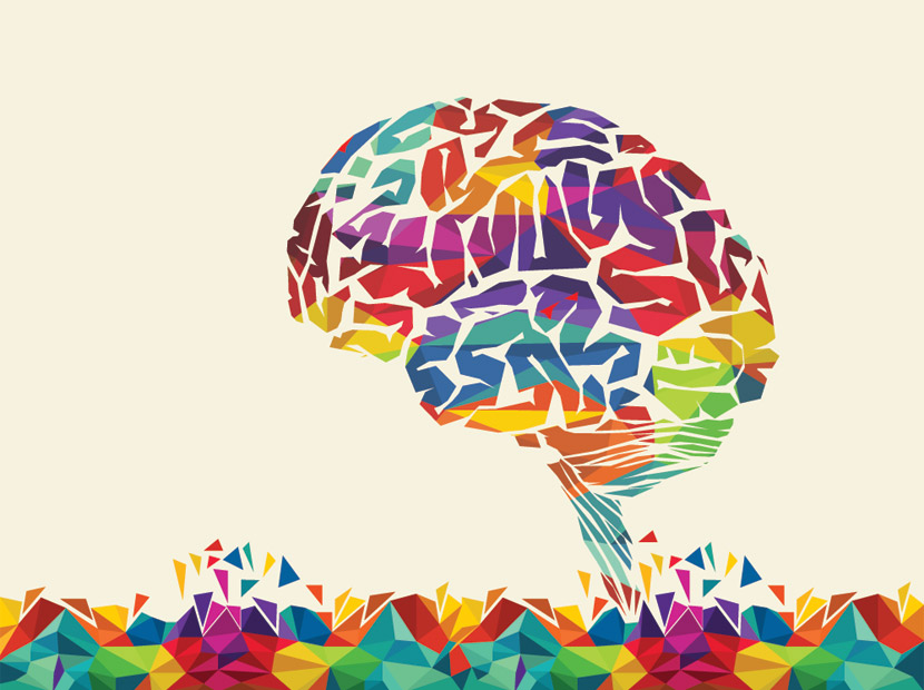
Even though we are not aware of it during the day, the colors we see around us tell us a lot. Colors affect our decisions, choices, physiology, and psychology. Brands that see the effect of colors on people know very well how to use colors to manage human perception. Let’s look at the meaning and characteristics of colors together and see examples of brands that use those colors in their logos.
White
At the University of Kansas Art Museum, they conduct an experiment to examine the effect of color on people. They establish a system in which the color of the walls in the museum can be changed by them. They find that when a white background is used on the walls, people stay in the museum longer and wander around more.

Brown
After the background was changed to brown at the University of Kansas Art Museum, they found that people moved much faster, moved around less space, and spent less time in the museum. Knowing this effect of brown, fast food restaurants make their walls brown to create more customer flow.
Red
Did you know that the color red is an appetizing feature? If you notice, you will see the red color in all the logos of food companies in the world. In addition, red raises blood pressure and accelerates blood flow. It symbolizes youth, fire, adrenaline. That’s why when you think of Ferrari, it is very typical to think of a red Ferrari.

Pink
It often evokes femininity. It gets its energy from the red color, but it is softer than red. It is a vibrant and energizing color. Pink colors are frequently preferred in products that women and girls can use. You can see that Victoria’s Secret, one of the brands preferred by women, frequently uses the color pink.

Blue
It slows blood flow and has a relaxing effect. It represents eternity and freedom. (Because it is a cold color, it is one of the preferred colors in cold beverage brands. Pepsi can be an example of this. In addition, blue reflects the meanings such as authority, power, loyalty, success. It is a color preferred by most official institutions and working with the state. İşbank, Turkcell, Yapı Kredi, Facebook are examples of these.

Green
Green nature reminds nature. That’s why it’s relaxing and calming. It also gives a sense of confidence. It is one of the two colors most preferred by banks. You can see that Garanti and TEB banks prefer green color in their logos.

Yellow
It has a remarkable feature because it is open and bright. It evokes a feeling of happiness and excitement in people. It is one of the attractive colors that encourages movement. This is the reason why yellow is used in parking lots and traffic signs.

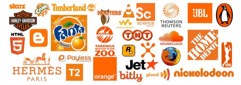
Orange
Orange is an extroverted, exciting and happy, dynamic, remarkable, striking, and heartwarming color. Orange color speeds up metabolism. It gives vitality, courage and confidence. It activates the mind.
Fanta, Teknosa, İng Bank, fox etc.
Fanta, Teknosa, İng Bank, fox etc.
Black
Black represents power and passion. Black color symbolizes mourning in our culture and western culture. You may have noticed that people wear black when they experience a sad event, such as losing a loved one. Unlike us, black is the symbol of happiness in Japan.

Note: It was the book “Dikkat Vücudunuz Konuşuyor: Türkiye’de Beden Dili İş Yaşamı ve Renkler (Attention, Your Body Speaks: Body Language, Business Life and Colors in Turkey)” by dear Ahmet Şerif İzgören, who encouraged me to write this article. I strongly recommend that you read the book. You can learn precious, life-saving information in daily life.
Kaynaklar: https://pazarlamaturkiye.com/markalar-icin-renklerin-dili/#:~:text=MAV%C4%B0%3A%20Otorite%2C%20g%C3%BC%C3%A7%20%2C%20sadakat,dikkat%20%C3%A7ekici%20bir%20%C3%B6zelli%C4%9Fi%20vard%C4%B1r.
https://www.neuro-mar.com/renklerin-psikolojisi-ve-algi-uzerine-etkisi/
https://www.leblebitozu.com/renklerin-anlamlari-ve-psikolojik-etkileri/
Attention: Your Body Speaks: Body Language Work Life and Colors in Turkey (Dikkat Vücudunuz Konusuyor: Türkiyede Beden Dili Is Yasami ve Renkler)


