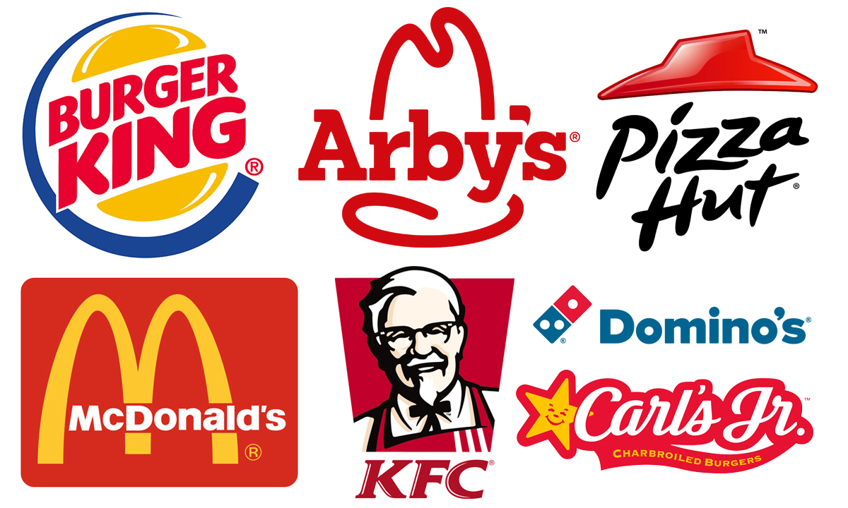

Burger King, McDonald’s, Arby’s, KFC, Pizza Hut… In addition to being a Fast Food chain, they have one more thing in common: their logos in red.
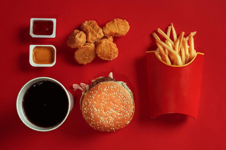
This is not a coincidence. Many companies use colors to connect with their customers. While fast food looks tempting enough, their red logos make it even harder to ignore.
A normal person can see an average of ten million colors, but red is special. One of the first colors our ancestors found important enough to name was red. Before the alphabet and writing, human language was colorless. There were words for “black”, “white” and “red” but that was all. Blue, on the other hand, appeared thousands of years later, in the 200s A.D.
As a result, we have more connections to red than any other color, and we react to it in a way that benefits fast food companies. Researchers have found that red evokes a sense of urgency. On top of that, it has the feature of giving a feeling of satiating our appetite. When you put these two together, you have a great recipe for customers who want to eat.
This red logo isn’t just a sneaky stimulant for your brain. Many ancient languages, including Hebrew and New Guinea tribes, named red with the word “blood”.
For example, in Hebrew, red is pronounced “ah-dohm”; blood is pronounced “dahm”. The bloody beginning of red has changed over time. In medieval times, red was worn by royalty as a status symbol. Today, brides in many parts of India are getting married in red dresses.
In fact, red is one of the few colors that all cultures around the world see with a positive outlook. Of course, companies have not overlooked this either, as they create their logos with much thought. After all, we are the visual species, and although we have five senses, our brain can process 80% of the information coming from our eyes.
According to marketing firm WebPageFX, about 85% of consumers say color is the main reason they choose one product over another. Another 80% of the group say that it is colors that give brands an unforgettable stamp.
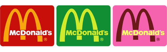
Imagine the McDonald’s logo is pink, green, or blue instead of red. It doesn’t feel the same, does it?
This post is also available in:


